Magic Groovy Era: A Retro Script Font That Delivers Campaign Personality
It was 3:47 p.m. on a Tuesday—two days before the launch of our client’s summer content series—and I was tweaking the final Instagram carousel. The vibe? Sunny, spontaneous, slightly irreverent. We’d already mocked up the first three slides in Figma, but something felt off in the headline treatment. The clean sans serif we’d started with read “professional,” not “playful.” Not “remember roller rinks and cassette tapes?” So I swapped it out for Magic Groovy Era. Instantly, the tone clicked. Not because it’s loud or flashy—but because it carries intention. A wink. A shuffle-step. That’s when I knew this wasn’t just another retro script font—it’s a campaign co-pilot.
What Magic Groovy Era Actually Feels Like (Not Just What It Looks Like)
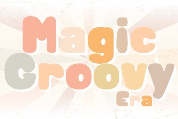
Magic Groovy Era is a Script Amp font—designed for impact, not subtlety. Its letterforms lean into the joyful imperfection of hand-drawn 70s signage: exaggerated swashes, rhythmic bounce, uneven baselines, and subtle texture baked into each glyph. It doesn’t mimic nostalgia—it *invites* it. Think of it as the typographic equivalent of a sun-faded concert poster: warm, confident, and unmistakably analog in spirit. It’s not chaotic, though—the spacing is carefully tuned, and the rhythm stays legible even at smaller display sizes.
This isn’t a font you’d use for body copy or legal disclaimers. But for a YouTube thumbnail headline (“Your Summer Skill-Up Starts Now!”), a Pinterest pin label (“Retro Recipes You’ll Actually Make”), or an email banner teasing a limited-time workshop? It delivers personality without sacrificing clarity—if used intentionally.
Where It Shines in Real Campaign Workflows
We tested Magic Groovy Era across six visual touchpoints in a recent digital course launch campaign:
- Instagram Reels Covers: Paired with a muted peach background and bold white stroke, it popped instantly—even in the tiny preview grid. The swash on the “G” in “Groovy” became a visual anchor.
- YouTubе Thumbnails: At 120px height, the uppercase “MAGIC” held its shape better than expected. Key trick: we avoided stacking more than two lines of text, and always kept the main word on one line.
- Email Banners: Used only for the hero headline over a soft gradient. No subheadings in the same font—those stayed in Inter Light. This preserved hierarchy and prevented visual fatigue.
- Pinterest Pins: Scaled to 600×900px, the font’s natural contrast worked beautifully against textured paper backgrounds. No need for heavy outlines or shadows.
- Digital Ads (Meta & Google Display): Limited to headlines under 5 words. We skipped it entirely for button text or CTAs—those went to a crisp sans serif (Inter Bold). Consistency mattered more than flair there.
- Branded Template Pack: Included as the “vibe header” option alongside a clean secondary typeface. Users loved having one go-to font that said “this series has energy” without needing custom illustration.
Readability Reality Checks (Especially on Mobile)
Here’s what we learned about legibility in fast-scrolling environments:
- Mobile previews: Works best at 28px+ on light backgrounds, 32px+ on dark. Avoid thin weights—stick to the standard or bold weight included in the package.
- Thumbnail overlays: Always pair with at least 2px white or black stroke when placed over busy imagery. The font’s organic edges soften quickly without it.
- Small caps or all-lowercase? Not recommended. The charm lives in its uppercase rhythm and signature swashes—especially on “G”, “E”, and “R”. Lowercase feels unbalanced.
- Line spacing: Default tracking is generous, but tighten it by 10–15 units when using two lines. Too much air between lines breaks the groove.
Also worth noting: it’s not built for long paragraphs, dense feature lists, or multilingual interfaces beyond basic Latin characters. Check the character set before committing to global campaigns—it includes accented letters common in Western European languages, but no Cyrillic or Asian scripts.
Smart Pairing & Practical Setup Notes
We consistently paired Magic Groovy Era with Inter (a neutral, highly readable sans serif) for everything from captions to navigation labels. The contrast works because Inter doesn’t compete—it supports. For print or packaging mockups, we also tested it with Playfair Display (a refined serif), which added editorial weight without clashing.
Before dropping it into client assets, we verified:
- The package includes OTF and WOFF2 files—enough for web, Figma, and desktop design tools.
- Ligatures and stylistic alternates are present (e.g., a shorter “y” tail for tighter lines), but we only activated them selectively—not as defaults.
- The commercial license covers social templates, digital ads, merch mockups, and client deliverables—no hidden restrictions for SaaS or e-commerce use.
- No variable weight axis—just Regular and Bold. That’s fine for its role as a display font, but don’t expect fine-tuned optical scaling.
When to Reach Past It
Magic Groovy Era earns its keep in moments that ask for mood, not mechanics. Skip it for:
- Form fields, pricing tables, or comparison charts.
- Corporate reports, investor decks, or compliance-heavy landing pages.
- Any context where speed-to-understand matters more than style—like emergency banners or accessibility-first UI components.
- Logos requiring extreme scalability (tiny favicons or embroidered patches), unless heavily simplified first.
It’s not a universal solution. It’s a deliberate choice—one that says, “We’re leaning into joy, memory, and movement.” And in a feed full of polished minimalism, that kind of intention stands out—not because it’s louder, but because it’s more human.